Mortgages with Seattle Credit Union
Mortgage campaign (2019)
for Seattle Credit Union
Role: Art Director + Designer + Animator
Task: Conceptualize and create a visual campaign for the mortgage loans that Seattle Credit Union offers.
I wanted to find a way to visually show all of the products in one set—and I did that with a virtual tour of mortgage products.
Deliverables:
16:9 monitor animation
with music
Uses: Website, branch monitors
Email Headers
Social Media Graphics
Music: PremiumBeat
Tools: After Effects, Illustrator
Email Headers
Social Media Graphics


PROCESS
Brainstorm, Sketch & Pitch
The main objective for this project was to bring more awareness to our mortgage products. In order to do that, we wanted to highlight the four main products we offer: purchase loans, refinancing, equity loans, and second homes and investment property.
It was my assignment to conceptualize and create visuals for this campaign. I would produce an animation and its components and delegate certain pieces to other team members.
I wanted to find a way to make everything cohesive and therefore could be separated for the various channels.
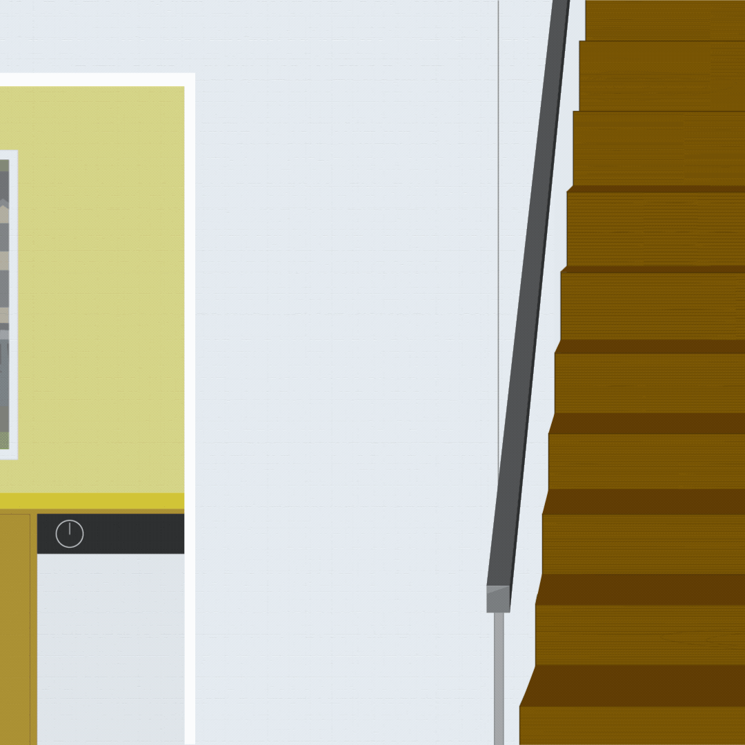
Because of my past experience, whenever I think of equity, I thought of a kitchen or an image of a kitchen. When I thought of mortgages and homes, I kept thinking about welcome mats—then it all clicked: each room of a house could help explain a product.
Empty Hallway: Purchasing
Living Room: Refinancing
Kitchen: Equity
Office: Second Homes and Investment Properties
Print options & Design delegation
The project was seen as very ambitious, but the pitch was approved.
Before my own production began on the animation, I needed to delegate a piece to the other designer on the team.
Some of my influences come from streetwear and fashion—and with that comes teasers. One of the elements that was needed was a statement insert.
Since I was going to eventually take viewers on a house tour, I had a few ideas:
people would need keys
people would need a welcome mat
people are interested in a floor plan
After some collaboration and realization of a hard due date, I decided the best teaser would be the keys.
Wireframing the scenes
While my teammate worked on the statement insert, I began production on the animation.
I wanted to design every scene myself. The only components that I would reuse from previous work was the outside of the neighborhood. This kept this campaign on-brand with the rest of our mortgage messaging.
The hallway scene would be empty and boxes were appear as you were moving in. It would also foreshadow what the kitchen looked like when a purchaser moved in.
The living room was exactly that: something lived in. Maybe it would be time for a homeowner to refinance after years of living in the home.
The kitchen scene would show someone adding value to their home by transforming their kitchen a more contemporary look.
The office scene would depict a place where business and planning was done. Blue prints, notes of construction beginning, a calculator on screen, and emails open. It would also transition to the call of action to visit the mortgage website.
Coloring the scenes
Because of my past projects, we had a full spectrum color palette to work with. I wanted to make the scenes vibrant, unique, and familiar with the color.
Like I did with my last equity campaign, I based some of the items off of my own experiences. There are some easter eggs in the bookshelf, a similar upgrade of dishwashers to the one I experienced at home, a familiar computer, a microwave style that made me want to upgrade a friend’s microwave, and a microwave and oven set up of a home that I hold dear to my heart.
Originally, each scene was to have a time-lapse. A full day would display while the script would display.
However, after getting the script written by our communications strategist, that element was omitted because it was unnecessary. The hallway and kitchen were the scenes that benefited from a time-lapse, but it became more of an implied lapse.
In the animation set up, lighting was added for drama. The 6th image is an screenshot of how dramatic and moody the office scene could be.

Keychain Animation
One of the animated elements that was needed was the keychain from the statement insert. After the statement was designed, I took the design that was created with the available assets we have, and made it move.
This element was used to promote the week of mortgage workshops that started this awareness campaign. This project and its initial communications was called, “Mortgage Week.” Here is the Mortgage Week animation for the branch monitors: